
A Visual Guide to our Water Quality Dashboard
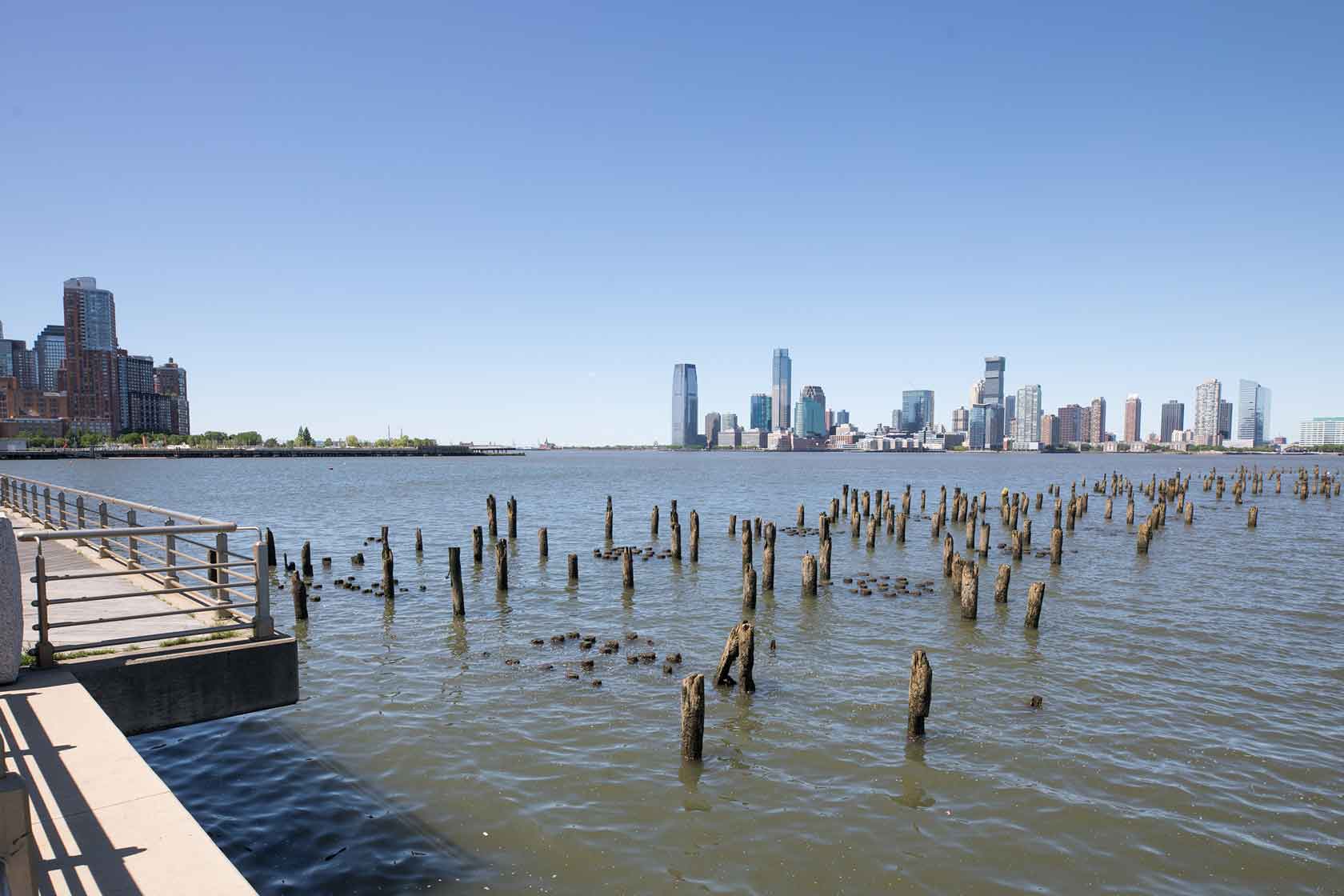
Have you ever noticed the Hudson River’s greenish-brown hue and wondered what this means for the health of our local wildlife?

One of the River’s signature qualities is actually its turbid (or cloudy) nature. This results from the two high tides and two low tides that we experience daily and the mud and silt which compose the majority of the bottom of the Hudson River. When mud, silt and water combine tidally, the result is a cloudy waterway with decreased visibility. That’s part of the reason why you can’t see the bottom of the Hudson River when standing from our Park esplanade.
Our River Project team collaborates with several organizations to continuously collect water quality data and monitor the River’s health. Hudson River Park is part of the Hudson River Environmental Conditions Observation System (HRECOS) network. HRECOS is a collection of monitoring stations throughout the River that gathers almost real-time hydrological and meteorological data every 15 minutes, which is publicly available. Hudson River Park has two stations, one at Pier 25 and one at Pier 84, that collect and transmit water quality and weather data year-round.
To help make this environmental data more accessible to a broad audience, including NYC students, the Park’s River Project team was thrilled to partner with Cantina Consulting, a human-centered design agency that works with organizations to design user-friendly experiences involving complex technology.
We are excited to share HRPK’s first-ever Water Quality Dashboard, a user-friendly digital dashboard that digs deeper into our local water quality and provides insight about the health of our local waterways. Through our partnership with Cantina, and with technical support from Dr. Wade McGillis of Columbia University, this dashboard notably includes a water quality model that predicts, in close to real time, occasions when water quality is degraded due to pollution events using actual and historic data.
Want to discover conditions in the Hudson River? Here’s our quick tutorial to get started using HRPK’s Water Quality Dashboard. The dashboard allows you to explore eight different aspects of water quality: rainfall, harmful bacteria, dissolved oxygen, turbidity, temperature, salinity, pH and tides.
To get started, you can either click on any parameter from the blue navigation bar at the top of the dashboard to jump to that section or start scrolling to cycle through each section. We’ll follow the example for dissolved oxygen for this visual guide.
Each measurement starts by listing its current conditions along with two key questions that aim to help you understand more about a particular parameter: “What is the measurement?” and “Why is it important?” These questions introduce background information about each variable. 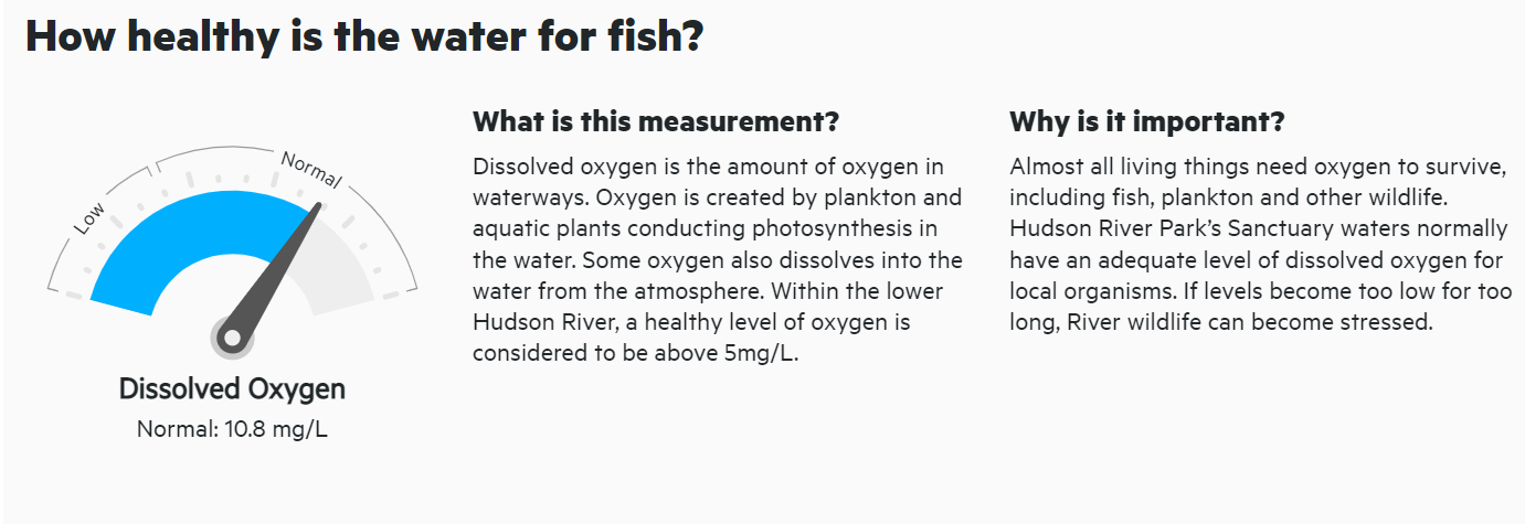
Below these initial introductions, you will see a graph of our HRPK water quality data over a longer period of time. This is important because it helps share how conditions can change seasonally throughout our local River ecosystem.
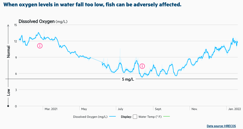
On this chart, you’ll also see some notable data points highlighted with a red information symbol “ⓘ”. Click there to take a deeper dive into our data and understand more of the science behind each water quality parameter.
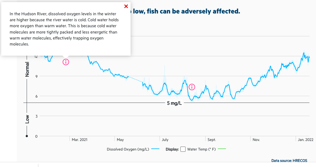
For example, if you look at the dissolved oxygen section, its line graph has two red ⓘ symbols. These mark the maximum and minimum dissolved oxygen measures from the past year. Clicking on the left ⓘ symbol reveals a pop-up explaining how temperature affects dissolved oxygen levels during the winter months where we see higher levels of dissolved oxygen. Similarly, by clicking on the right ⓘ symbol, you can view the other side of this phenomenon, where summer months bring lower levels of dissolved oxygen in our local waterways.
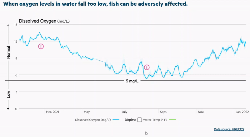
Because many of our water quality measurements have interesting relationships, we’ve also included a checkbox where you can overlay another parameter and reveal the interconnectedness between these two elements. You’ll find this checkbox below the graph. When you click, you will see an overlay of water temperature and dissolved oxygen data on the same chart. Displaying two parameters like this together helps show some important relationships. In this example, the highest dissolved oxygen data points correspond with the lowest water temperature measurements and the lowest dissolved oxygen data points are observed with the highest temperature.
There’s so much more to learn using HRPK’s Water Quality Dashboard, and we hope you enjoy scrolling through and exploring the interactive features. We’re excited to share this resource and provide the public with a new way to explore our local waterways and the environmental factors that affect them.